By Greeshma Rawat & Devrat Singh

Introduction
India is predominantly a vernacular country. Out of its 1.4 billion population, only 140 million people (~10%) speak English and less than 0.1% of the total population speak English as their first language in India.
Language today is arguably the biggest critical barrier to digital inclusion in India. While the country is experiencing a digital revolution, is digital truly inclusive in India? Despite the country being multi-lingual, English continues to be the dominating language of most digital products that are available today and some of the devices in the market also don’t support vernacular fonts creating an added layer of complexity in building apps for Bharat.
Legacy industries particularly such as transportation and Logistics are the types of industries where the literacy of English is well below the standard 10%. At the same time, these industries are undergoing digital transformation with mandates like Fastag, GPS coming into effect. If a trucker sitting in a remote village needs to adopt to digital, he needs a trustworthy digital partner, an app that is easy to use, technology that is empathetic to his limitations and most importantly is in his language of convenience.
Truckers in India are the last bastion to be included in the digital economy. He is a different user from a regular eCommerce consumer, localization and humanization of the user product experience is extremely paramount in gaining the trust of the trucking community. And this is what we have been doing at BlackBuck; continuously understanding the nuances of the trucking ecosystem to customize and better our product offerings. The journey hasn't been easy though! We made mistakes, we listened, we learnt and we went back to the drawing board, when we had to.
In this two-part blog series, we attempt to give you a peek into what goes behind designing tech products for the underserved small fleet operators of India and the several insights that emerge along the way...
A Typical BlackBuck User and His Needs
First, let’s understand the demography that is using our BlackBuck app. A typical user in this highly unorganized and undigitized industry has the following persona:
- Male, typically in is 30s/40s.
- Class 8 or 10 graduate.
- Not tech savvy but has a basic understanding of the core functionalities like ‘scroll, search etc., that are common across apps.
- English is not his first language. Only a handful in his community / peer group can read and write basic words in English.
- On an average receives or makes 50+ work calls a day. Has limited mental bandwidth to ‘explore’ apps.
- Trust in online platforms is very low and the onus lies on the tech platform to gain his trust.
Such a user needs a lot of convincing and handholding throughout the adoption journey. And if this needs to be done at scale it requires a combination of human touch and a superior product experience. On the one end, we laid the foundation for a large distribution network with people deployed across 14,000 pin codes of the country and on the other, an app that is highly customized for a trucker. A fleet operator, unlike your urban consumer, is not willing to invest in a product or a service for the sake of convenience. This customer is struggling day in & day out to make his ends meet, he will try only those products which can make his economics improve.
The challenge in product designing was always about whether we are solving the right problem for the truckers which helps in improving their business. Are we addressing the trust factor? Is our service reliable, that works 24*7? Can my customer reach out to my team even at 3.00 am in the morning? And finally, is my product in their language of convenience?
How did we first find out about the need?
The above discussion makes a solid case for the Humanization and Localization of the content. This was something that was also consistently observed by our Product team in all their User Immersion sessions. Even our ground sales team had given us input that a decent chunk of users was having a tough time using the app in English
We also found some users who had learnt the buttons and sections by color and location on the screen.
- This was still a hacky solution for categories which are transactional in nature (For example - Features like recharge that have fixed steps and can be memorized.)
- In an exploratory category like a Marketplace, this method was falling flat and thus adoption was suffering.
All this was further supported by a few data points like:
- Digitally acquired customers from vernacular ads had a higher drop-off rate after installation because while the ad was in their language, the app wasn’t.
- Outbound User Telecalling activities showed that the low adoption of the users was primarily because of the language barrier.
How did we validate the requirement?
While the inputs were coming from all directions, it was important for our product team to validate these requirements at scale and then lay down the path ahead.
The first part was verifying if this was the user's conscious need. Were they already phrasing their problem statement into a need for this feature? Or was this a latent need that would solve the issues of the user?
Based on extensive user research, the team was able to identify that this was a clear need for ~40-50% of the users. However, they were not able to put this exact solution requirement into words. Thus, we needed to revalidate the same with some sample designs!
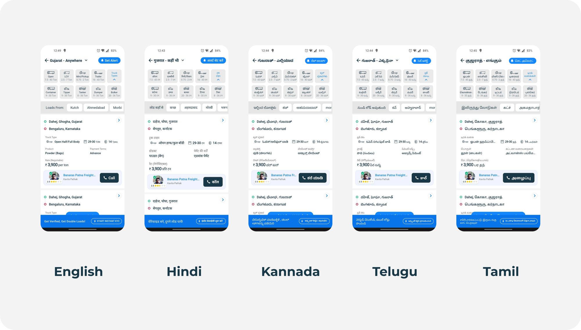
The team then identified the top primary languages for ~95% of our user base. These came out to be Hindi, Tamil, Telugu, Kannada and a few were comfortable in English. We built sample screens for these users and did extensive user immersion with over 50 users across geographies in the North, South, East and West.

When we piloted this in the market, we received positive feedback from the users. Truckers were elated to finally be able to use a product that solved THEIR problems in THEIR language, all the while being easy to use and understand. The users also liked the fact that the copy style was more conversational and personal and felt less like a machine that was communicating to them!
One prime example of the power of localization was seen during the following meeting with a fleet operator:
We visited a truck owner, whose daughter helped him out with the business. We attempted an experiment with this duo. We showed the trucker the BlackBuck app in English and he was quick to respond - “I can't read English. Please explain it to my daughter”. We then showed a vernacular translated sample screen to the daughter. As soon as the trucker saw the app screen in vernacular, he became interested in the app. He immediately took away the phone from his daughter and started using it himself. He then went on to ask questions about our service and product.
Rajendra Kumar who was previously dependent on the younger generation when it came to managing tech was now included in the digital realm thanks to localization.
Plan of Action…
After we had validated the needs of the users, the next step was to sketch a plan of action for the product copy to be unified in all languages and tones. It wasn't enough to just launch our products in vernacular languages, we needed to go deeper with our product localization. We wanted our product to speak to the users the way they talk on an everyday basis - simple, informal, conversational, contextual and a mix of English with their local language. Hinglish, Kanglish, Tanglish - you name it, we created multiple combinations of copy to make it highly relatable and convenient to use.
How did we do it? It was a lengthy process that yielded the results we were looking for. Stay tuned to find out...
Blog design by Puranjai Pratap
Part 2 coming soon!
