By Greeshma Rawat
An inside view on how BlackBuck conducts user research and testing to build better products

User Research and its importance
User research is essential to building a better product because it provides insights into the needs, preferences, and behaviours of the people who will finally be using the product. The goal of user research is to gather insights that can further enable the design and development of products & services; making it relevant, functional and meaningful to the users.
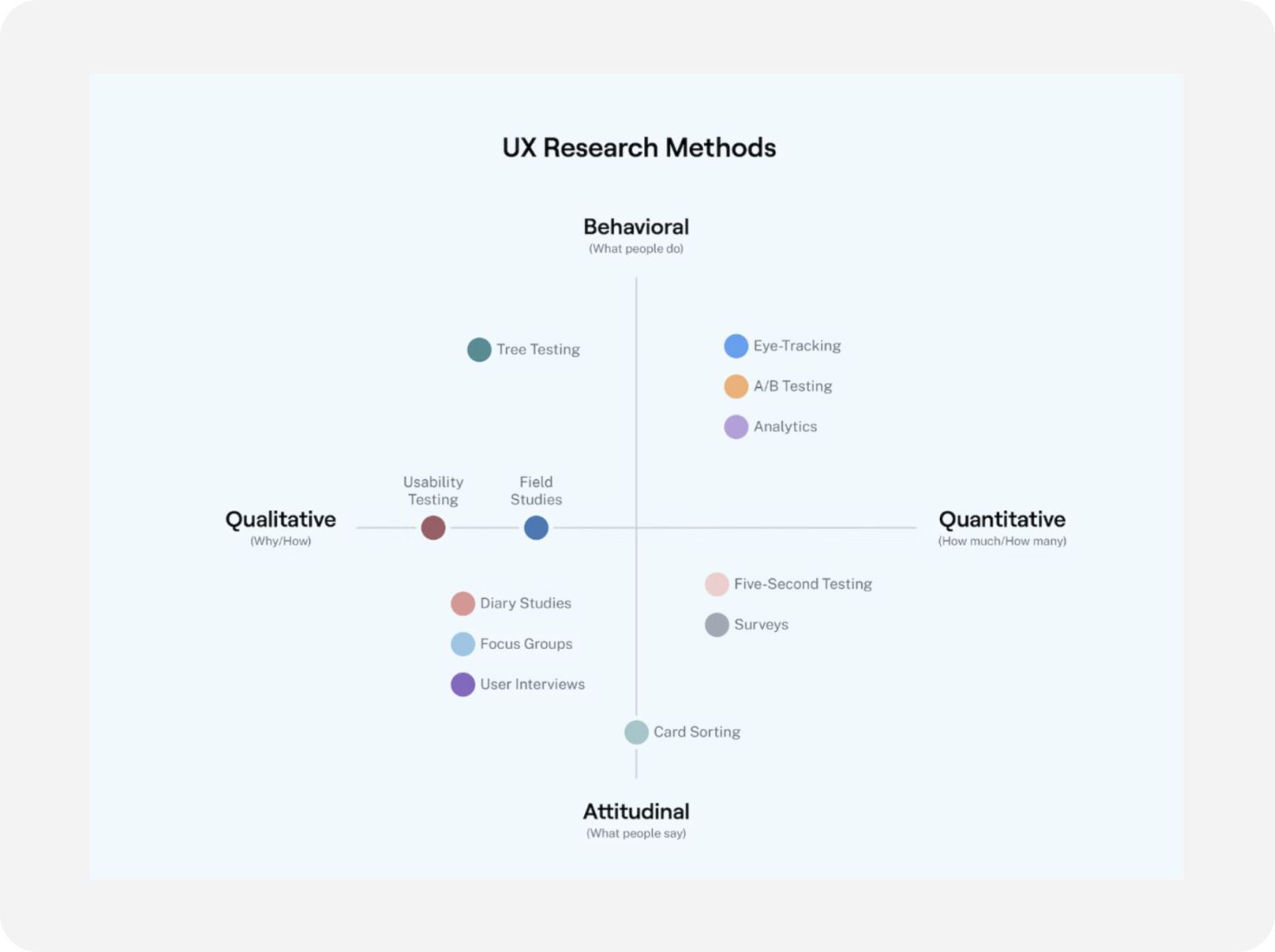
There are various user research methods, including qualitative and quantitative approaches. Qualitative methods, such as interviews, focus groups, observations, and usability testing aim to understand the subjective experiences and perspectives of users. Quantitative methods like surveys and analytics aim to gather numerical data to measure user behaviours and attitudes.
The insights gained from user research can inform various aspects of product development, including product strategy, design decisions, feature prioritization, and marketing messaging. By incorporating user feedback and insights into the development process, businesses can create products and services that better meet the needs of their target users, leading to higher user satisfaction and improved business outcomes.
Overall, user research is essential to building a better product that meets the needs of its users. By understanding user needs, creating a user-centred design, testing assumptions, improving usability, and reducing development costs, user research can help ensure a product’s success.
Qualitative Research
When conducting user research and usability testing, there are a variety of qualitative methods available that can provide valuable insights into the needs, behaviours, and attitudes of users ( as mentioned in the image below).
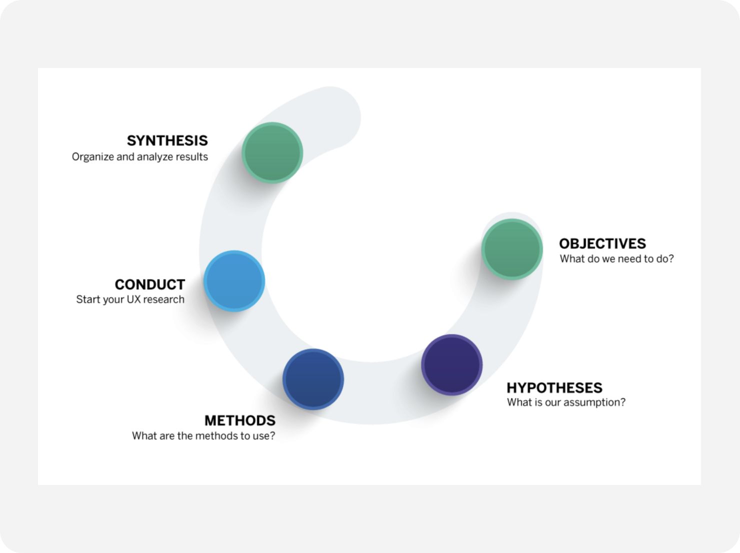
The next obvious question is — which method to use. Well, it’s important to experiment with different methods to determine which ones work best for your objectives.
Research challenges with truckers in India
As a trucking marketplace in India, BlackBuck aims to understand the needs and expectations of its target audience to provide a seamless user experience. However, the target audience may not be very educated, which poses a challenge for user research and usability testing. Many methods of traditional research don’t work with our users. Some crucial problems we face during our research -
- We cannot fix appointments with them for one-on-one interviews or telephone interviews.
- We cannot expect a dedicated amount of time even if we meet them.
- Telephone interviews are cold calls — whoever answers and is willing to talk.
- The interviews are (almost) always interrupted — they get a call, start talking to someone else or pick up another task.

Truckers in India have a unique lifestyle and work in an industry that operates differently from traditional 9–5 businesses. The trucking industry is open 24/7, and truck owners are constantly on calls, looking for loads or trucks, enquiring about the location of trucks or loads, and following up on payments. Due to these factors, their priorities and needs are different, making conducting user research and testing challenging.
Moreover, many truckers are not familiar with the concepts of user research, testing, and surveys or their importance in the development of a product that they use. As a result, getting feedback from them can be difficult.
Research Methods at BlackBuck
To overcome the above challenges, BlackBuck has adopted various research and testing methods, such as one-on-one interviews, phone call interviews, and sending screenshots of designs via WhatsApp to gather feedback and on-site user testing. These methods allow BlackBuck to obtain the necessary insights from truckers without making them feel like they have to put in any extra effort. By using innovative research methods, BlackBuck can understand the unique needs and priorities of its target audience and develop products that cater to their requirements.
1. One-on-one interviews
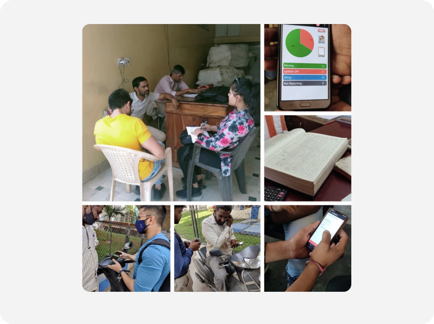
In these interviews, we talk to individual users to understand their experiences, pain points, and suggestions for improvement. One-on-one interviews are usually conducted on-site, i.e. a transport hub where many BlackBuck-using transporters can be found in close vicinity. This method allows BlackBuck to gain in-depth insights into the user’s perspective and tailor the product accordingly.
Limitation
Conducting one-on-one interviews can be time-consuming and resource-intensive, limiting the number of users who can participate.
One-on-one interviews with our users, who are predominantly truck owners and transporters, present unique challenges due to the nature of their work. As the trucking industry is not highly organized, fixed appointments are not always feasible. Our users may have unpredictable schedules and may not be mindful of allocated time. As a result, interviews can range from 15 minutes to an hour, depending on their availability and mood. It’s common to catch them amid their work, requiring flexibility and patience. Interruptions such as phone calls or other tasks may occur during the interview, leading to potential delays. Therefore, conducting interviews with our users requires adaptability and an understanding of the demands of the trucking industry.
Research Example — Interviewing users for overall feedback on the BlackBuck app
In Jodhpur, we conducted interviews with a group of users to gather their general opinions about the app’s usability. Our objective was to gather information on their preferences, grievances, and any challenges they faced while using the app.
Our goal was to understand how our app was being used by users and identify ways to improve their experience, which required us to engage in individual conversations with them.
As the interviews were conducted individually, we had sufficient time to understand their requirements and difficulties, gaining valuable insights into their experiences.
Research Impact
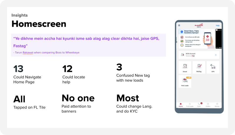
Having one-on-one interactions with the users provided an excellent foundation for revamping the app. These detailed interviews gave us valuable insight into how the users interacted with the app. We discovered the other apps they used in their daily routines and what aspects they appreciated about those apps. This knowledge helped us identify what modifications we could implement in our app.
2. Telephone Interviews
BlackBuck also conducts phone call interviews with its target audience. Phone call interviews are cost-effective and allow researchers to reach a large number of users quickly. In phone call interviews, researchers ask users questions about their experience with the product, their pain points, and suggestions for improvement. Phone call interviews also allow BlackBuck to gather feedback from users who are geographically dispersed.
Limitation
Our phone calls to users are not prearranged. We receive a list of users to interview and begin contacting them. However, the process can be unpredictable as users may decline to speak or hang up after only a few minutes, and may not answer all questions. Despite these challenges, we persist until we receive adequate feedback from a targeted number of participants. Typically, for every 20 feedbacks received, we need to call an average of 50–60 people. Therefore, conducting interviews via phone requires persistence and adaptability to navigate the variability of user engagement.
Research Example — Finding out if the Chats feature is as important for users as the Calls feature
Our aim was to provide truck owners with the ability to communicate with transporters on our platform through the Chats feature. After a month of its release, we wanted to see the significance of this feature to our users.
The objectives of this research were -
- To find out why certain users used the chat feature before calling a transporter.
- How important was the chat feature to users in comparison to the calls feature?
We decided to call the users for this research because we were looking to gather qualitative feedback from users in a relatively short amount of time.
Research Impact
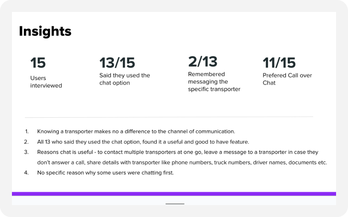
The research data provided a clear indication that the users did not consider the chat feature as a must-have feature, but rather a nice-to-have feature. While some users expressed positive sentiment towards the chat feature, the overall data suggested that it wasn’t as important to them as the call feature. This information helped the product team to focus on developing or improving the features that were more essential to the users.
3. Sharing designs via Phone
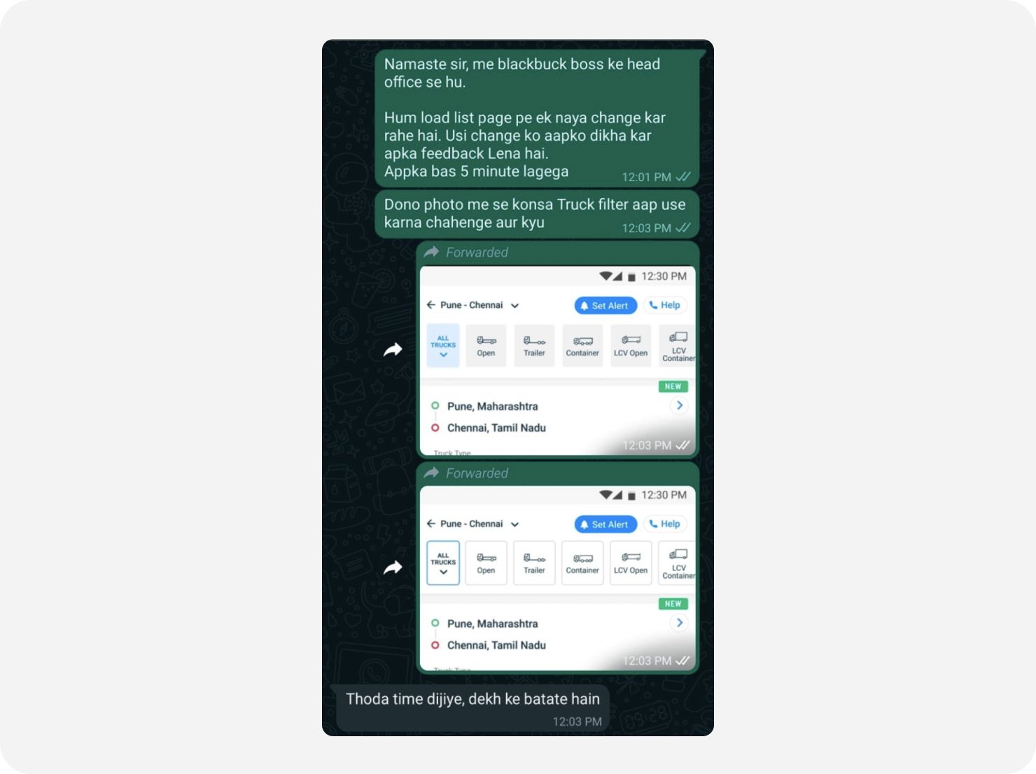
Sending screenshots of designs to users and asking for feedback is another method used by BlackBuck. This method is particularly useful when the user is not available for a one-on-one or phone call interview. Sending screenshots of designs to users allows BlackBuck to gather feedback quickly and efficiently. It also allows users to provide feedback at their convenience, making it more likely that they will respond.
After the screenshots are shared, and once the user has responded to the message, we call the user for detailed feedback.
Limitation
While sending screenshots via WhatsApp to users for feedback can be a useful method, it does have its limitations. For example, some users may not respond quickly or require multiple follow-ups, making the feedback process slower and less efficient. Additionally, it can be difficult to convey complex navigation flows through screenshots alone, which can make it challenging to get comprehensive feedback on a design.
This method can only be used to gather feedback on a single-page design or to compare multiple options. When using this method, it’s important to be clear about the specific design or copy elements you’re seeking feedback on and to provide context for how the screenshot fits into the broader design. Additionally, it can be helpful to follow up with users to clarify any questions or concerns they may have and to ensure that you’re getting the most useful feedback possible.
Research Example — Assessing the degree of correlation between Boss and BlackBuck and the change of app icon colour for users through testing
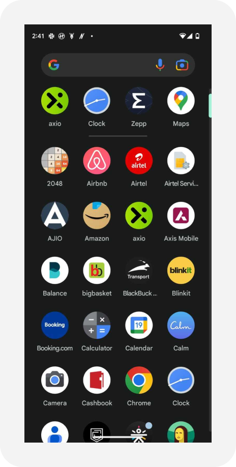
Branding changes in the app icon that we wanted to test —
- Change from Boss Transporter to BlackBuck Transport.
- Change of colour from red to black.
Prior to making this transition, it was essential to determine whether our users could understand the new icons as we wanted to prevent them from experiencing any confusion while searching for our app on their mobile devices.
Since it was just an icon we wanted feedback on, we thought it would be best to share a screenshot with the users.
Research Impact
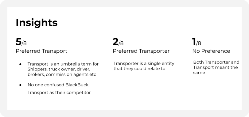
The research also provided us with another unique insight, revealing that the words “Boss” and “BlackBuck” were interchangeable for our users and that changing the app name or icon colour did not cause any hesitation in their decision to choose the app.
4. On-site User Testing
In some cases of Usability Testing, BlackBuck opts for going directly to the user. This is done through an interactive prototype made in Figma and then presented to the user to interact with.
For this method also, we visit transporters in their offices (usually in a transport hub where we can find multiple BlackBuck-using transporters in the same place). The researcher, with the help of a translator (if required), gives the user the context of the testing and then shows the prototype (of the feature to be tested) to the user to interact with.
During user interaction, observations are made on how the user is interacting and any friction points he is coming across while interacting. Post interaction, the researcher (at times) asks some questions with respect to the experience of the user.
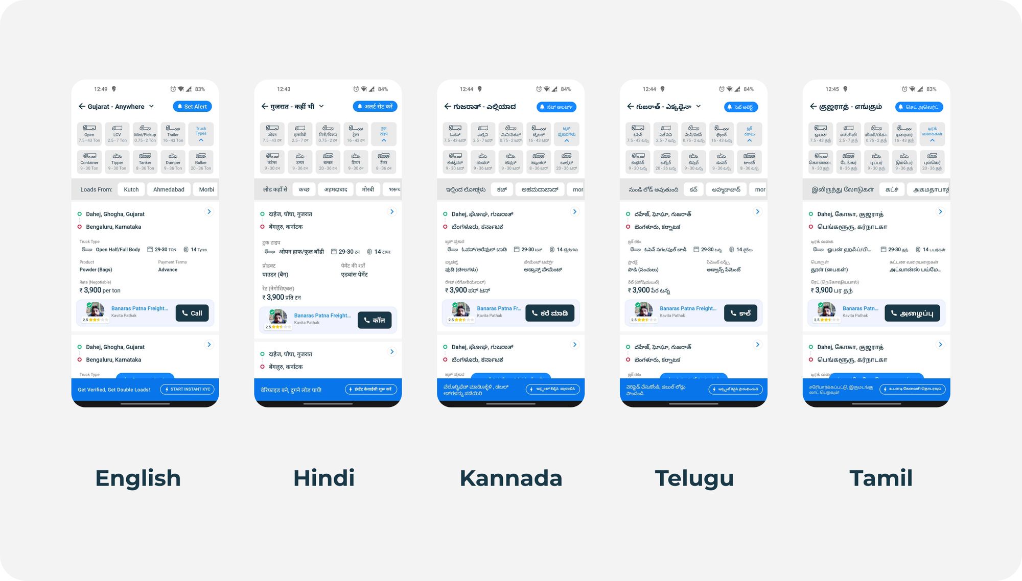
Because the BlackBuck apps also support regional languages, the prototypes are also made in different languages depending on the area we choose for testing. Testing in Rajasthan would mean the prototype would be in English and Hindi. Whereas testing in Karnataka would require us to prepare the prototype in English and Kannada.
One big advantage of this method is that the user has minimal disturbance to his schedule as the researcher conducts testing in his environment and hence, his comfort zone. So, the observation and feedback are more genuine and accurate.
Limitation
- While this method is highly effective in knowing the actual response in normal scenarios, going directly to the user’s place may not bring accurate results in some cases. If there is a busy occasion for the majority of transporters like festivities, or if there is a sudden loading/unloading spike in the transport hub (and it happens at least once or twice a month), then the majority of transporters won’t be available for user testing. Even the ones who agree are often in a hurry so they might not give a very genuine response about their experience.
- Since users are not familiar with the concept of testing, many have to be explained what a prototype is, and why they are asked to interact with it just like they would with an actual product.
“For instance, a user was once shown a prototype with made-up data, and he thought it was real. He could not understand why something made-up was being shown to him.”
Research Example — Finding out if the users were able to use the ignition on and off feature
The lock and unlock feature is a crucial aspect of BlackBuck GPS and sets us apart from our competitors. This additional layer of security was promised to our users, making it vital that they know how to use it effectively.
Also watch: User testing of Ignition Lock/unlock
Research Impact
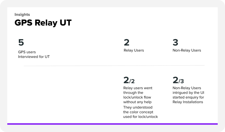
The usability testing helped us validate the UX of the feature. The users were able to lock and unlock the ignition and understood words like ignition and relay.
Conclusion
At BlackBuck, we have experimented with and adopted multiple methods for user research and usability testing to overcome the limitations of a target audience that may not be very educated and tech-savvy. Through trial and error, we have been able to develop our own unique way to conduct research and usability testing to gather valuable feedback from its users and improve its product accordingly.
