What it takes to design a user-friendly theft protection feature for trucks!
By Rishabhkumar Uday
Introduction
In the last part of this blog series, we discussed the importance of robust telematics solutions, described how our theft protection (relay) functions in a vehicle and how it's controlled through the GPS app of BlackBuck. However, like all product design journey, the Relay feature in its first version had room for improvement in its design. In this part, we are going to describe in detail what were the hits & misses in our first version, how we approached them in our reiteration and how we eventually reached the new design of Theft Protection (Relay).
Problem Statement
This was the initial process to lock/unlock the ignition through the app:
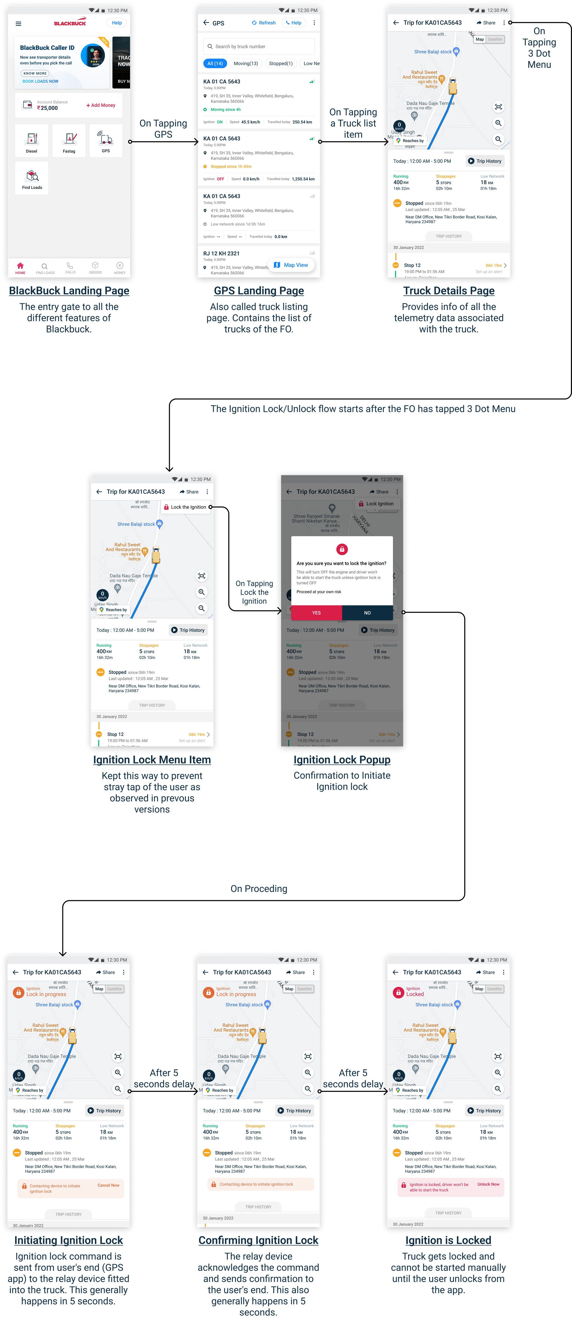
In this case several problems were found in both UX and UI fronts.
UX Problems Found
#1. Setting wrong expectations for the User:-
Once the user proceeds with locking the ignition, the pop-up closes to reveal a new information component within the details page.
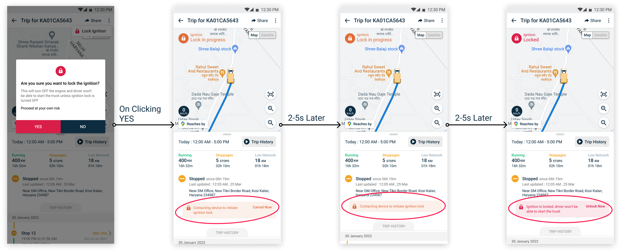
Since there is no prior intimation of the next step, the user expects the ignition to be locked/unlocked instantly, which is not always the case. There are a few edge cases where this process takes time. But this information is not shared with the user. And when the lock/unlock takes time, the user assumes that the page or app is malfunctioning — clearly not a good user experience.
#2. Poor handling of Exception:-
Speaking of exceptions, Lock ignition has primarily two of them:
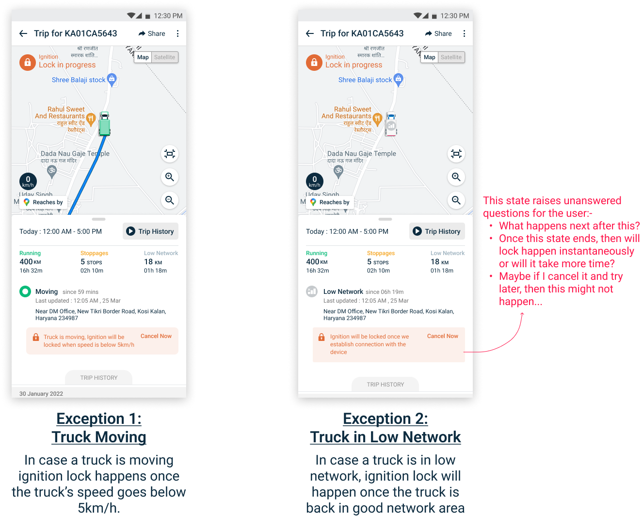
As shown in the figure above, the unanswered questions arise because these states are not treated like exceptions. Rather, they are treated like an add-on step which sometimes confuses the user.
#3 Unexpected and unexplained changes in controls
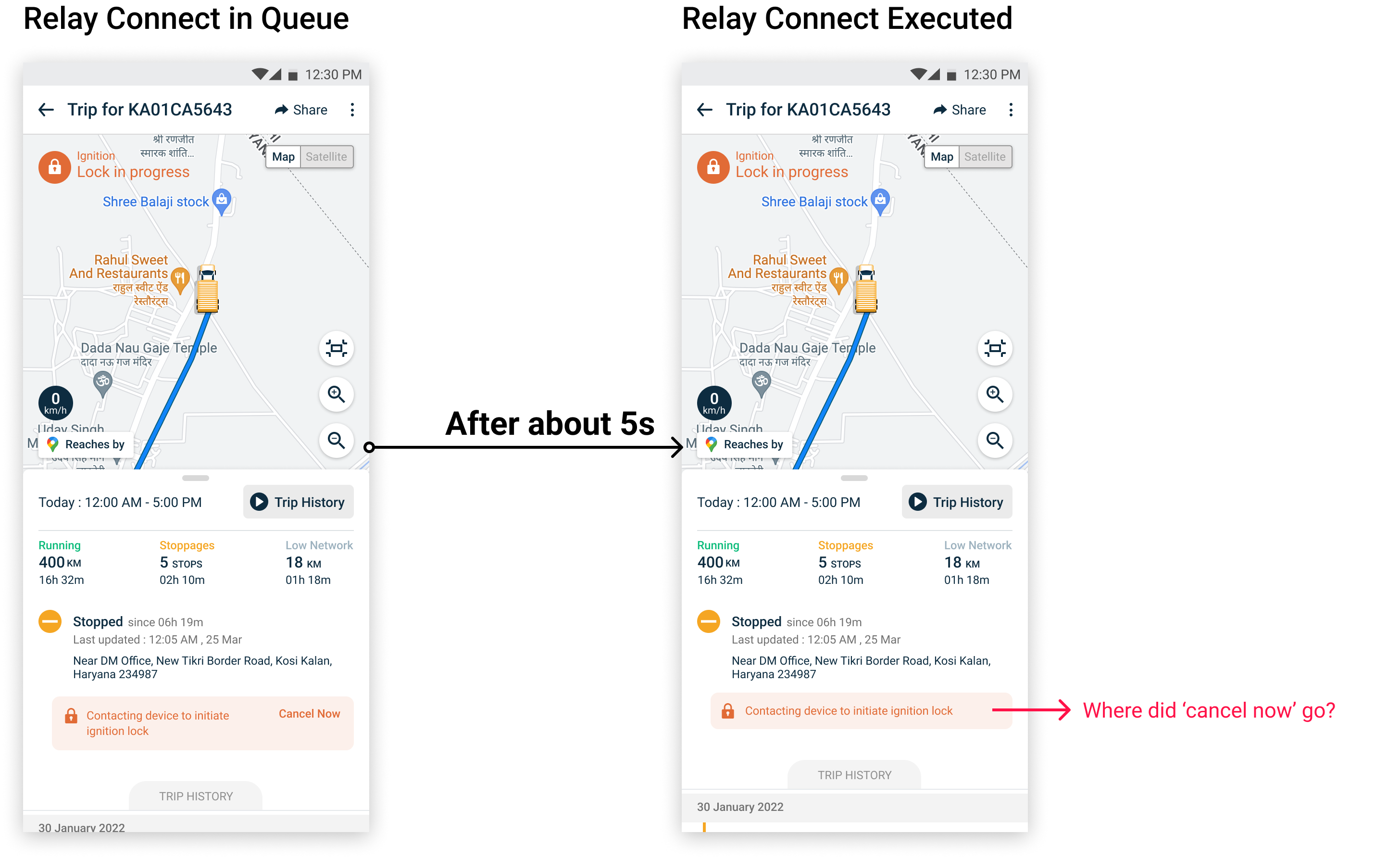
In the lock/unlock process, once the sending of the ‘lock’ signal is complete, the option to cancel lock/unlock is removed without any prior explanation. This is done because after the signal is sent to the truck, the lock/unlock process becomes irreversible from the back-end.
UI Problems Found
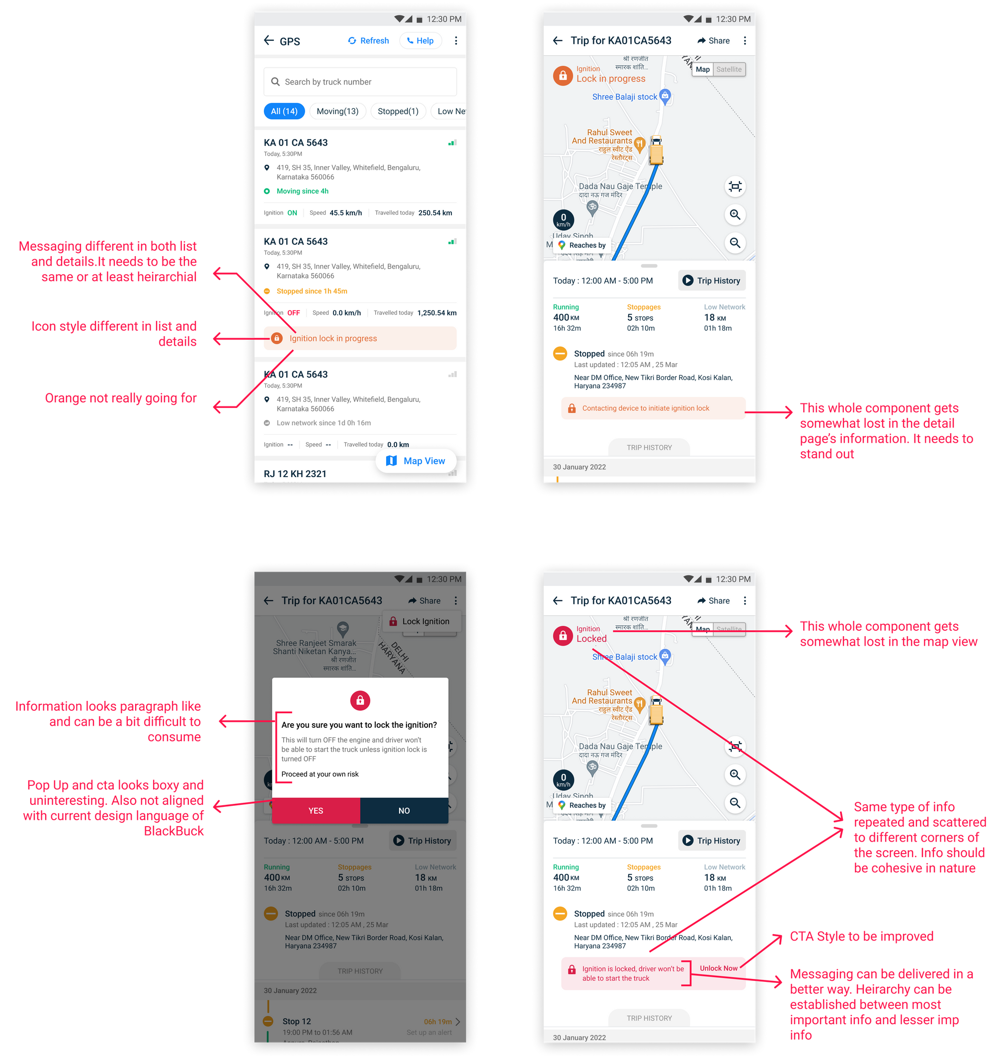
Solution Process
Once the problems were specified, we worked on a viable solution through:-
- Analytics Review and Stakeholder Discussions
- Revised User Flow
- Design Concepts
- Final Design
Analytics Review & Stakeholder Discussions
We checked the overall distribution of time taken to complete a lock/unlock process. Based on the numbers, we were going to decide what approach to take for the solution model.

Numbers in approximate figures
Based on the distribution and the problems specified, several guidelines were laid out:-
- In the majority of cases, the lock/unlock happens within 1 min. Hence, it was decided that the new design would be focused more on that strata. Since the interaction would last for 1 min in most cases, the overall process of lock/unlock would be seen in a direct and upfront manner by default when initiated. The user would be given the option of leaving that upfront view whenever they feel so.
- In case the user exits the upfront view, a secondary notification component would be present (to inform him of the ongoing progress of lock/unlock in the backdrop) in the truck list and details page.
- The difference in nature of the ongoing lock/unlock process (initiated > in progress > successful) will be shown evidently in the new design.
- Messaging will be regularized throughout the UI.
- Controls, when needed to be disabled, will be disabled with proper reason given to the user.
Revised User Flow
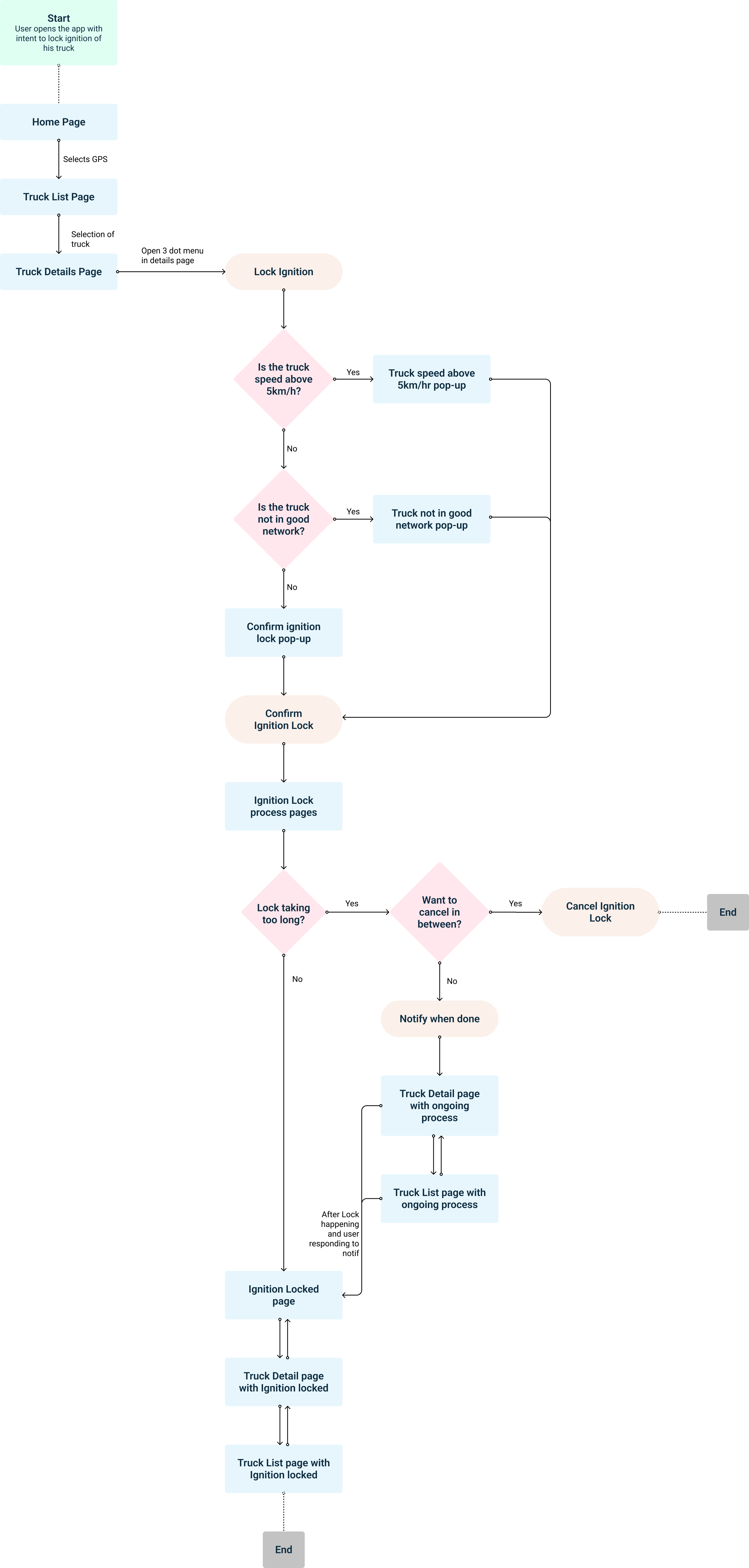
Design Concepts
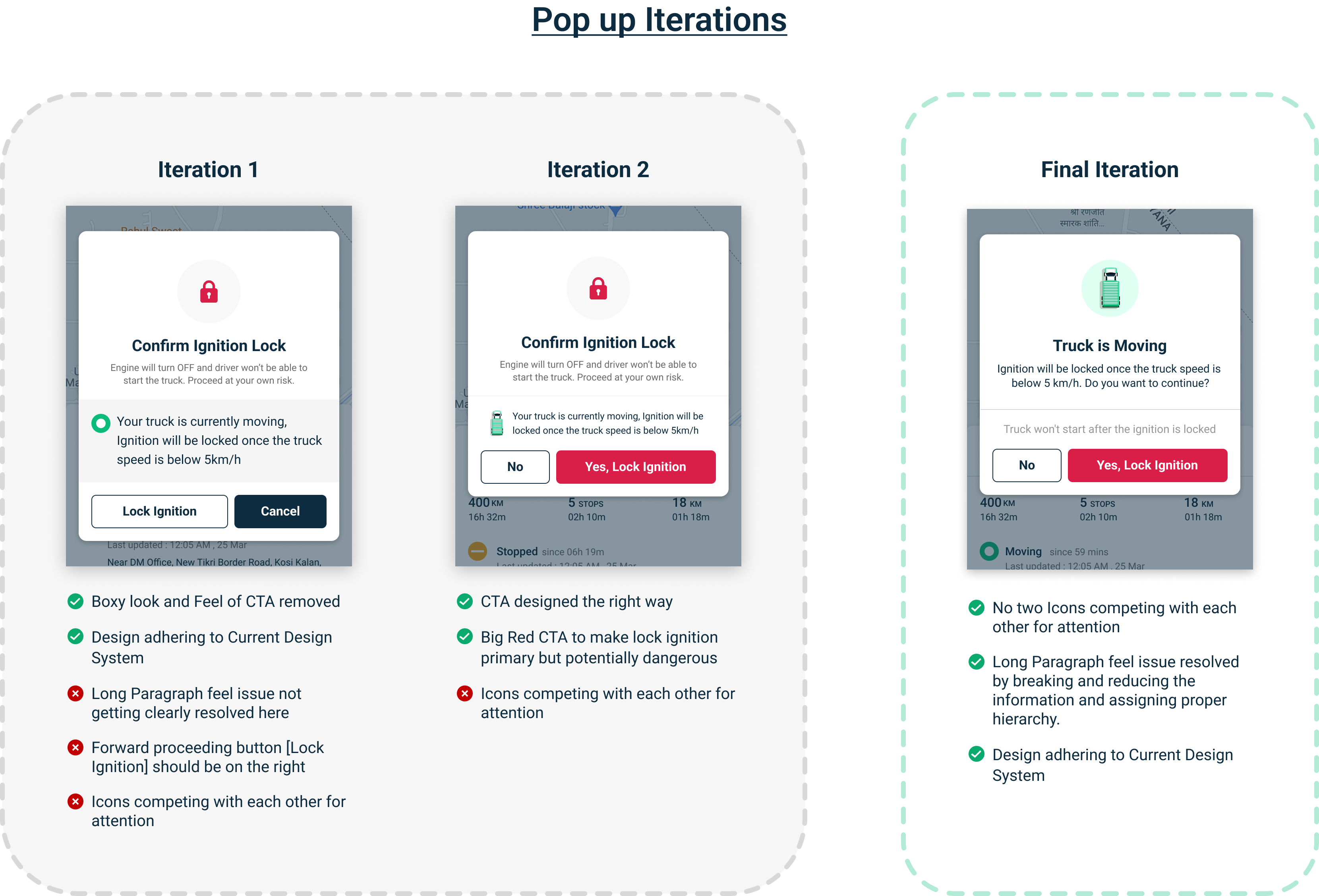
Initially, two iterations were made and their UI analysis was done to differentiate their pros and cons. We then took the pros and cons of both the iterations into consideration and then combined them to design the final iteration, maximizing the pros and eliminating the cons.
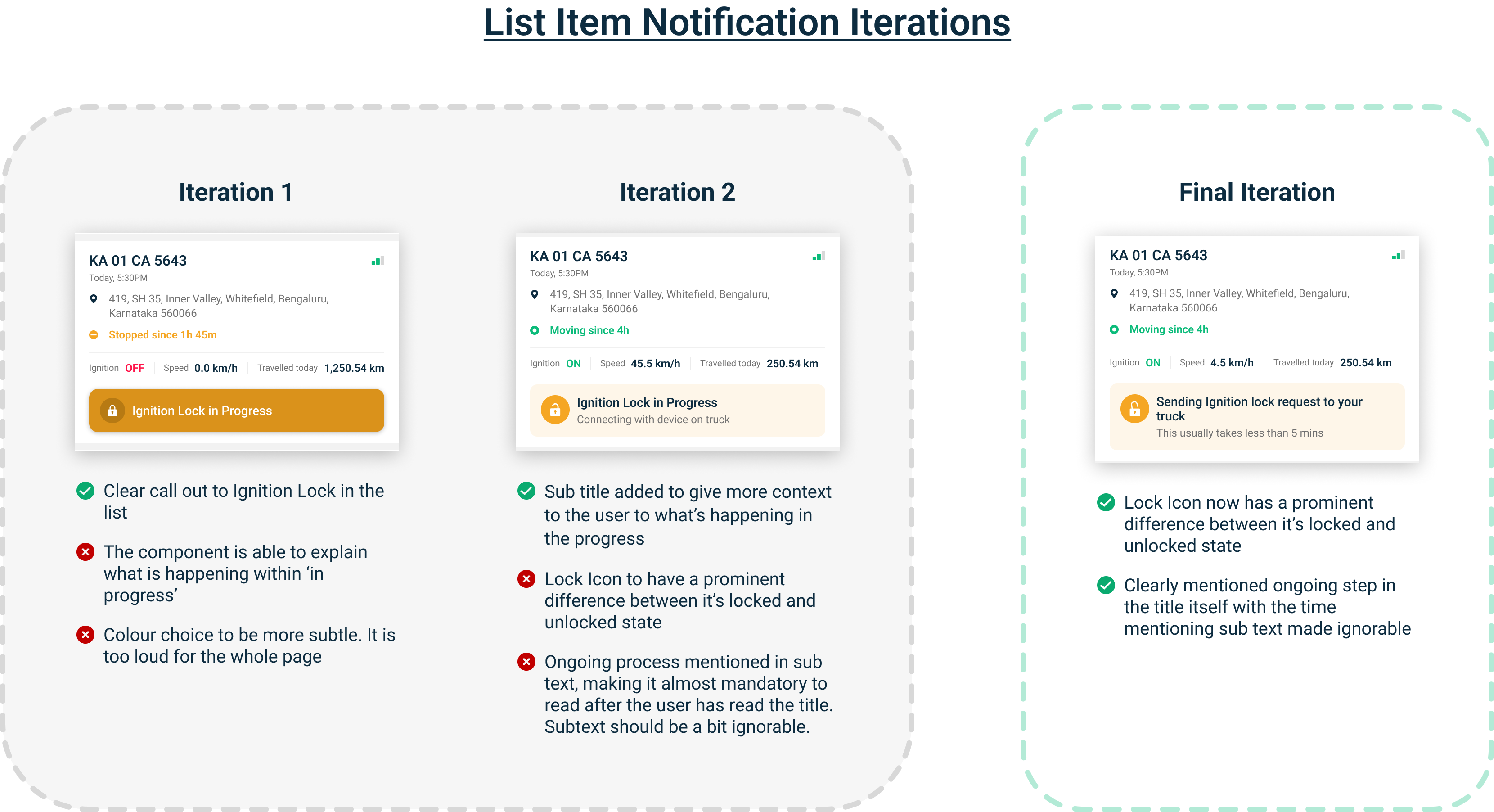
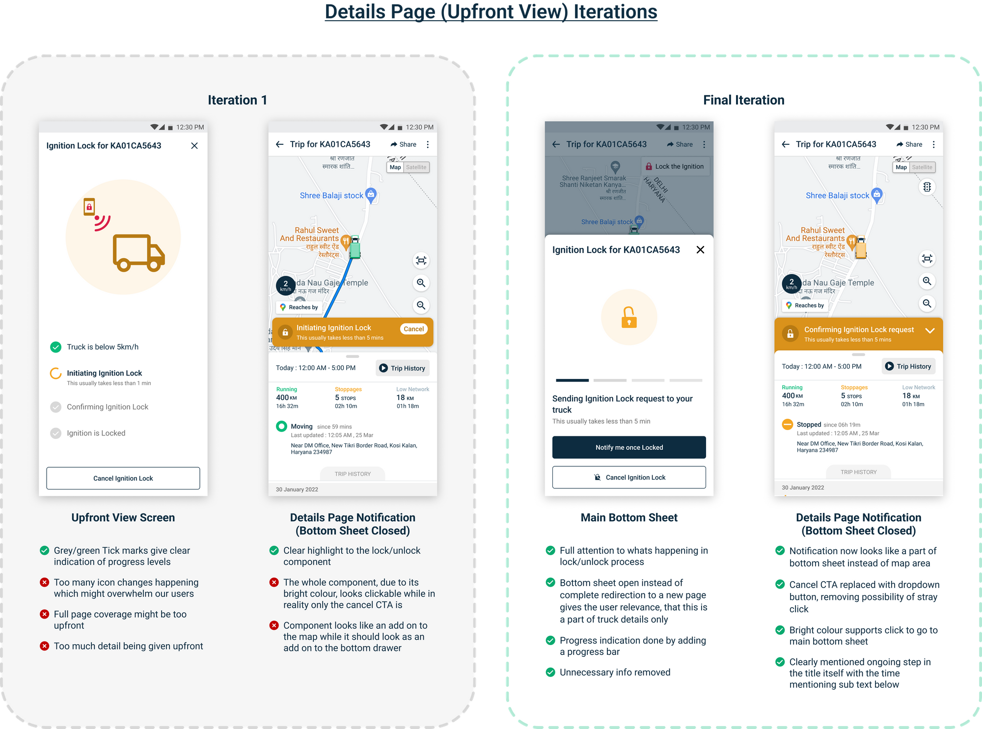
Final Design
Following all the iterations, we came out with the final solution which was later implemented into the application.
Here below are the Final Design Snippets
Main Screens
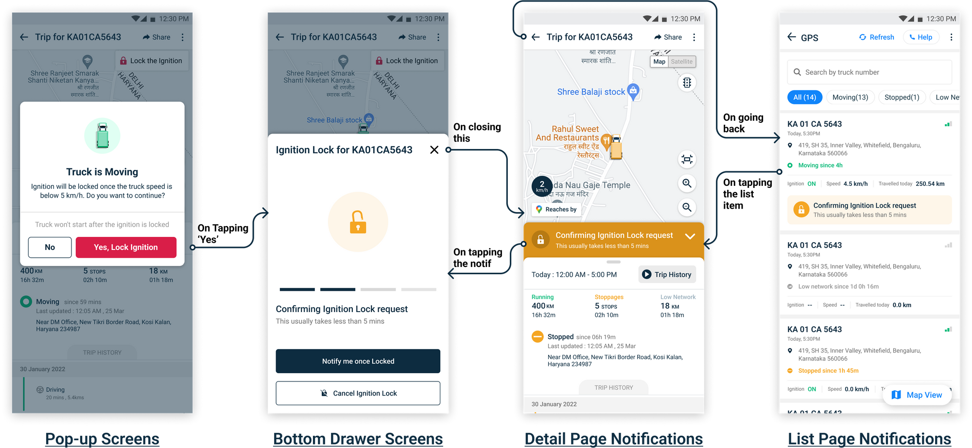
Revised Lock Process
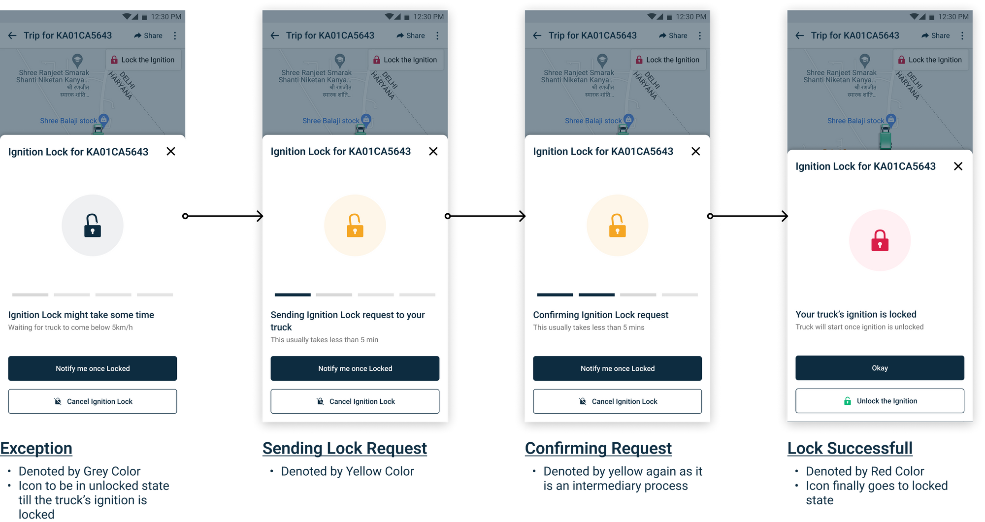
Revised Unlock Process
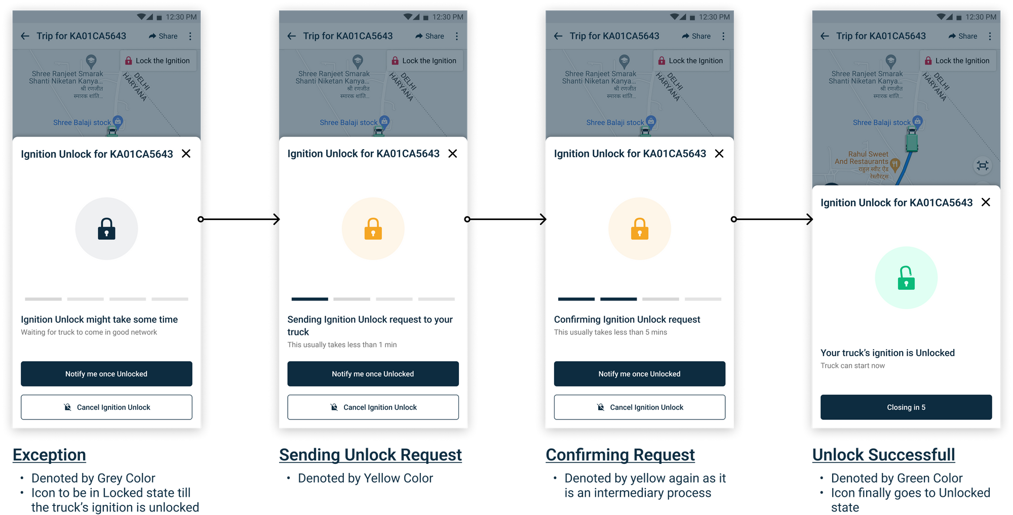
You can also view Final Design Prototype on the link below
User Testing of Design
- Post design completion, to verify the usability of the new Relay (Ignition) lock/unlock pages, we went to a transport hub based in Yeshwantpur, Bangalore.
- There we tested out the new design with 5 randomly picked local truck owners. 3 of them had relay installed in their trucks while 2 were non-relay users of BlackBuck.
The gist derived from testing
- Relay users went through the lock/unlock flow easily and by themselves.
- They understood the color concept used for lock/unlock.
User testing of Ignition Lock/unlock
One user commented while going through the flow: “Red matlab lock, green matlab unlock. Yellow bole to thoda thoda lock ya thoda thoda unlock.”
Translation: Red means lock, green means unlock. If its yellow its either a little locked or a little unlocked
The non-relay users were intrigued by the screens shown. After going through the flow, they started enquiry with us for relay Installations.
A non-relay user commented: “Acha ye relay kitne ka aata hai?”(how much does this relay cost?)
We took these results as usability verified and finally handed over the design to the developers to be implemented.
Conclusion
The redesigning process taught us many things — how to identify the correct problem statement, dealing with each scenario is important, being helpful and transparent to users is the priority and user testing at an early stage will always give you the right feedback at the right time.
The project has so far resulted in a smooth adoption and understanding of relay lock/unlock features by the users. What earlier used to be somewhat hidden in between the other details of the truck, now appears upfront to the users when activated, giving users the clarity of what’s happening. Earlier, relay/lock unlock was treated as a complex thing (by the users) with unknown steps. Now, comprehensively it is getting treated like a simple tool that is easy to use and is involved in the day to day life of the user.
Thank you very much for taking your time out to read this. We hope you found it interesting. Cheers from BlackBuck!
