By Greeshma Rawat & Devrat Singh
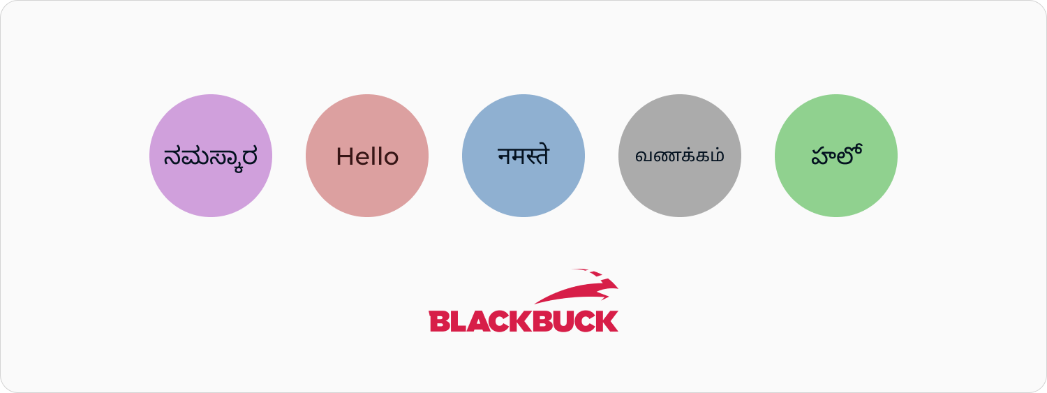
Recap
Part 1 of this blog talked about the growing need for localization of our product. We found out what our users needed and validated it through usability testing and user research. The end goal was for our users to be able to use our product on their own and with ease.
Getting down to the Brass tacks of Product Localization
In this second part, we aim to go deeper, give you a sense of what product localization really means and take you through the nuances and challenges while creating our product copy - easy, conversational and colloquial.
How did we solve the problem?
Solving this problem statement was a daunting task with over 30 thousand strings to be translated into four new languages for over 1000 app screens. And that was just the output displayed to the user. There were information input flows across the app that needed to support the same languages in the keyboards, character limits and suggestions for these inputs. All of this was broken down into multiple steps that eventually took us almost 8 months to solve.
Step 1: Establish the Product Voice
The first and foremost requirement was to figure out the Voice of our Product. Based on the user's needs, we wanted our tone to be conversational, colloquial and our language to be clear and precise.
- Day-to-day conversational
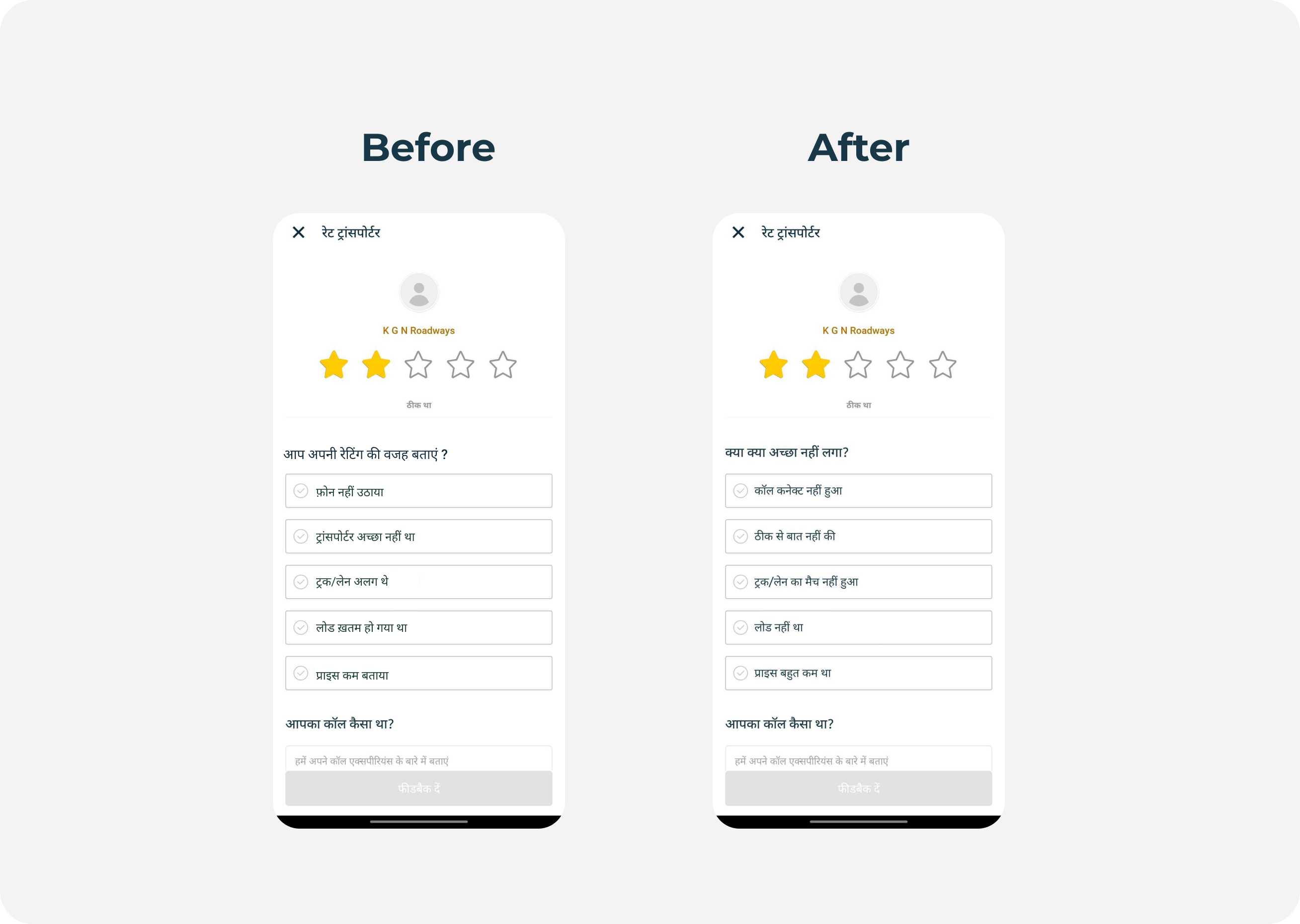
We wanted to speak to them just like they would in day-to-day conversations with a friend, while also keeping it crisp and contextual.
2. Transparent
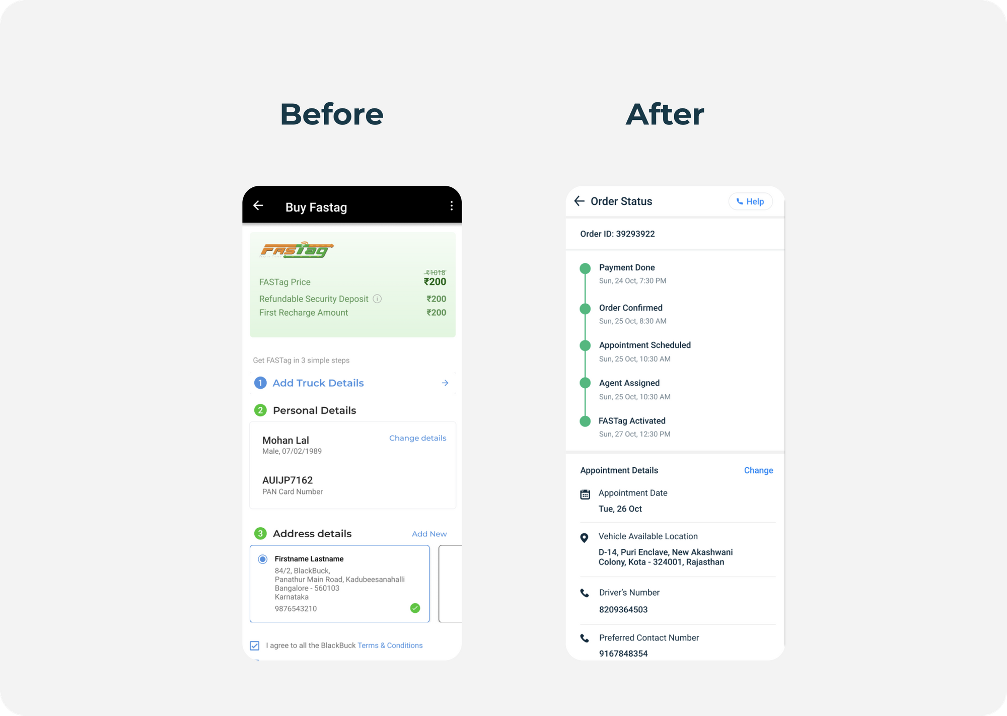
It is very important to give the users the right information (without alarming them) to gain their trust.
3. Helpful
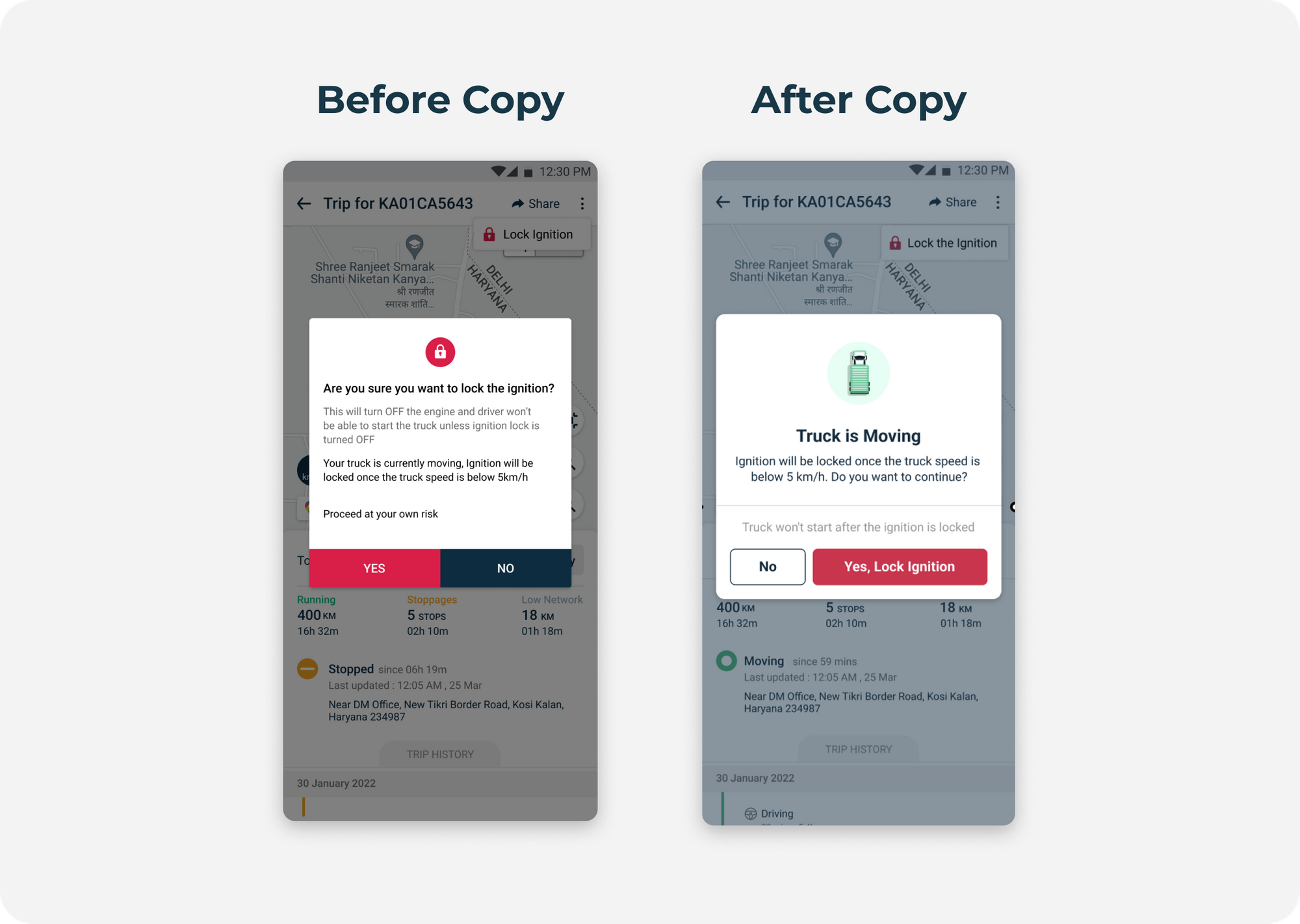
We do not want the users to think they do not have enough information to make smart decisions for themselves. We want to help them understand why they are doing what they are doing!
Step 2: Setup a Process
- Language Audit of the app to identify and correct the gaps
- Hired a localization agency for translations
- Integration with a localization tool to streamline the process
- Usability testing for every update - Design & Copy
Step 3: Build Product Capabilities
With all the processes in place, we moved on to building the translation capabilities throughout the app. These involved 2 parts:
- Built translation capabilities for all the texts across the app (all information outputs)
- Built flows for vernacular keyboards and translated suggestions while searching (all information inputs)
Since we are an app with multiple categories, this was done one category at a time and took a total of 4-5 months.
Step 4: Collect User Feedback
Post the launch of the first set of translations, we also started conducting user immersion sessions in parallel to take feedback on the translation quality. This was done on a large scale with over 100 users. With increased interaction with our users, we learned not to take our understanding of things as absolute. Some of the learnings were:
- The language has to be at its simplest and in a way they understand.
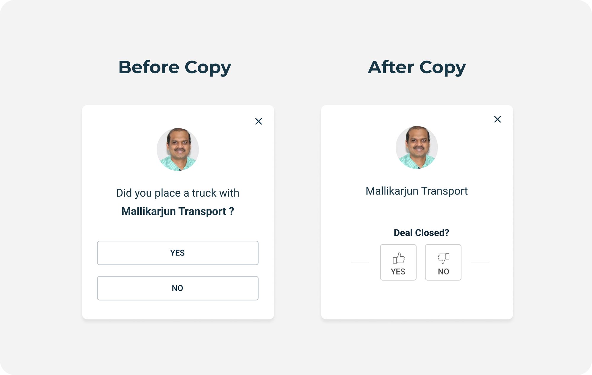
- Since we live in a country with diversity in culture and language, the understanding of certain words and phrases in different parts of the country is not the same. It was important for the copy to be colloquial and contextual. Example - Words like Bid and POD (Proof of delivery) are understood by most people from the South of India. But in the North, Boli (बोली) for Bid and Pohoch (पोहोच) for POD are more commonly used. For users with Hindi as their app language, we decided to use these words instead.
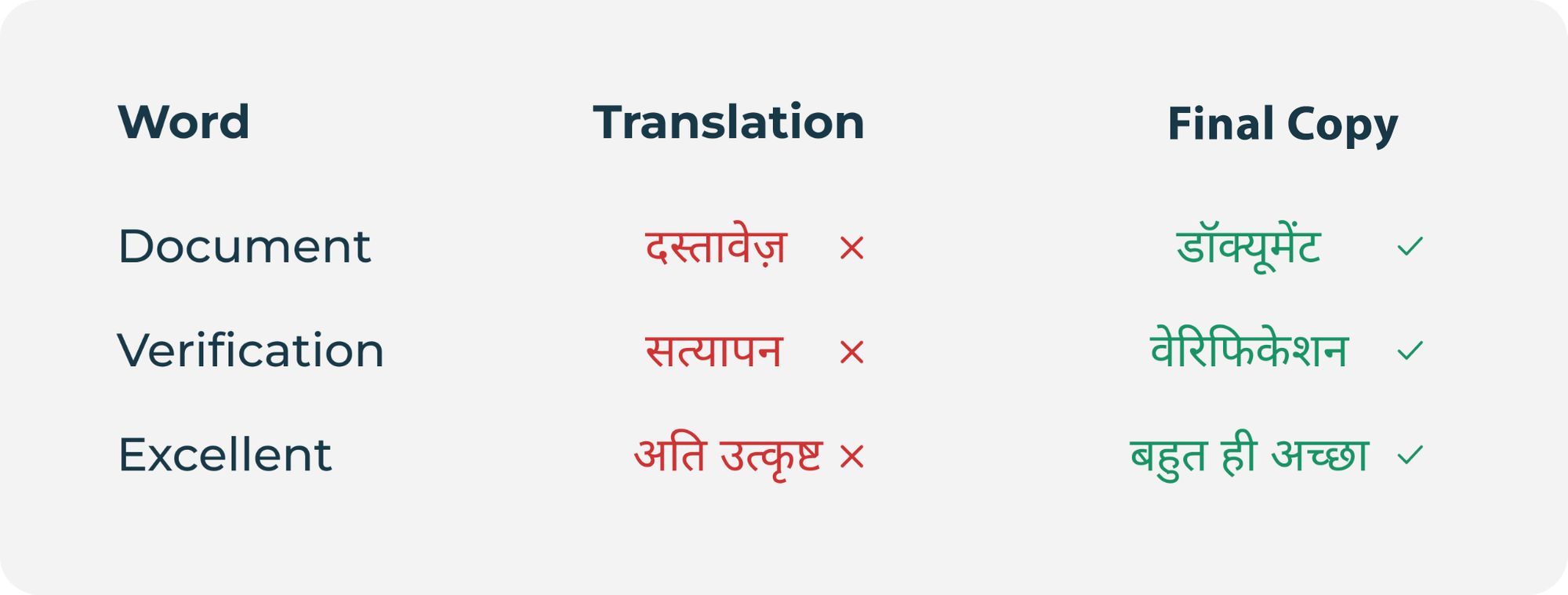
- The user feedback also brought forth another interesting observation. We realized that we need not do a pure translation of every word. In fact, some words and phrases are more commonly used in English (even by non-English speaking people)
Step 5: Introduce Language Selection Option
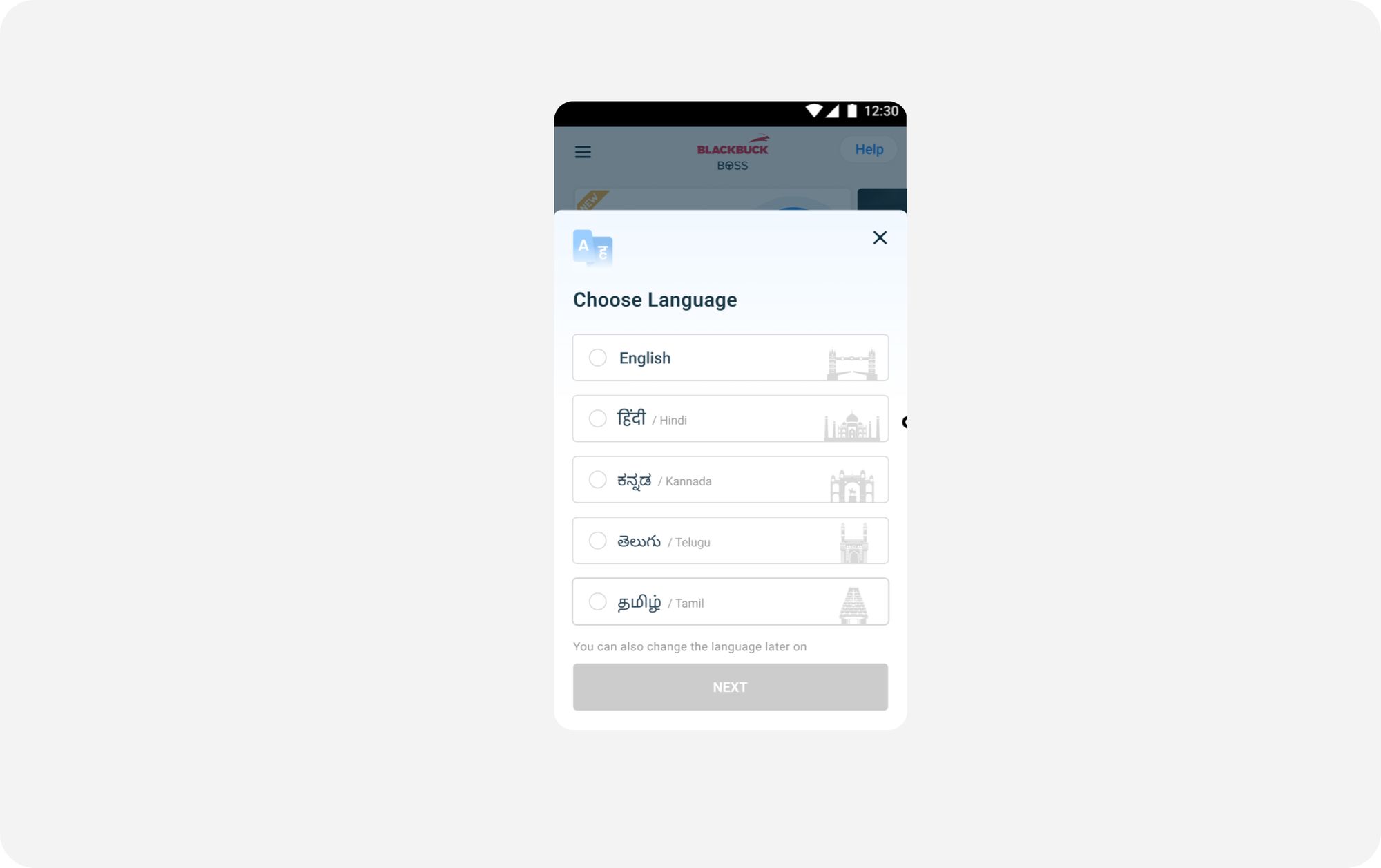
Finally, after all this, it was time to introduce the language selection option to the users across the user journey. We introduced the language selection screen in the signup flow for the new users and on the home screen for old users. The hierarchy of language options on the app was based on the city of the user with English always being the second option. For example, a user in Kanpur would see Hindi first, English second, followed by other languages.
What was the outcome?
Gathering such fine insights and customizing our product for non-digital natives helped us gain tremendous trust in the trucking community. We spent several months reiterating the smallest of the product features based on our user feedback, their preferences and behaviors. The outcomes that we have been seeing since has been very inspiring. Here’s the impact in numbers:
Conclusion
Working on a helpful and engaging product experience while maintaining consistency in language and tone is an ongoing process. With the processes that we have established, we hope to improve our conversation with our users at every stage. The learnings, the un-learnings and grassroot level impact have been able to create so far has been very encouraging for BlackBuck; making us believe that we are moving in the right direction in our journey of building tech for Bharat and digitizing the trucking ecosystem at scale.
But this is just the tip of the iceberg. We are geared and excited to innovate, build and design several more compelling products that will drive the future of trucking...
Blog design by Puranjai Pratap
Read Part 1: https://eng.blackbuck.com/why-humanization-and-localization-of-product-is-critical-in-fueling-digital-inclusion/
